
Case study
Smokin' Grill BBQ Food Customization Restaurant Application
Project overview
The product:
Smokin' Grill BBQ is the perfect place which fulfill the dreams of the food lovers. Creating a BBQ mobile app to help people place group order or individual order online and pick up multiple orders at once, so they can skip in-store lines or can do table booking online. Maintain a high standard of food quality and service. Ensure a friendly comfortable atmosphere.


Project duration:
July 2021 to December 2021
The problem:
Busy workers have lack of time to prepare a meal. To prepare BBQ at home is too difficult because it needs so many expertise, techniques, equipment's and patience to cook.


The goal:
Our Smokin' Grill BBQ app will let users order food online which will affect users who have no any time to cook food, by ordering food online to get food on time. We will measure effectiveness by tracking orders through app.
My role:
UX designer designing an app for Smokin’ Grill BBQ restaurant.
Responsibilities:
User research, conducting interviews, conducting usability studies, user journey map, Wireframing (paper & digital) , low and high-fidelity prototyping, accounting for accessibility, and iterating on designs.

User research : Summary
Smokin’ Grill BBQ provides a memorable experience when they dine in as well as online delivery. The objective of this project is to provide a seamless digital experience to their customers that is consistent with what they deliver. I conducted interviews and created empathy maps to understand the users I’m designing for and their needs. A primary user group identified through research was working adults who don’t have time to cook meals. Design an app for the restaurant that allows users to do online order easily and can do table booking online. It provides the customized barbecued food at home according to the food lover’ choice.
User research : Pain points
Time :
Working people have lack of time to prepare a meal.
Offers & Discounts :
Personalized discounts, deals and offers should be highlighted on page so that user attracts to use the app frequently.
Convenience & Productivity :
Navigation should be inline with the actions of user.
Content should be highlighted , short & crisp and user-friendly designs.
Accessibility :
Platforms for ordering food are not equipped with assistive technologies

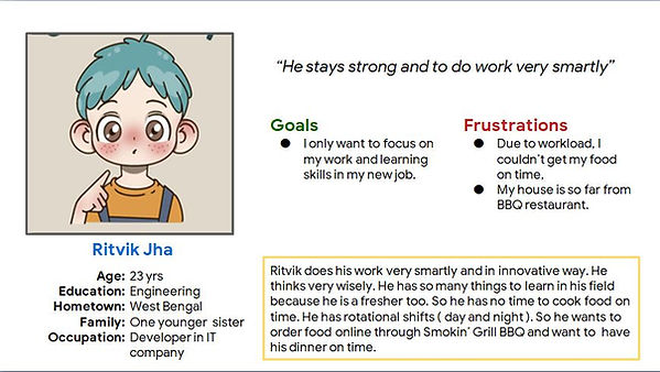
Persona: Ritvik Jha
Problem statement:
Ritvik is a busy working adult who needs easy access to healthy food ordering options and want to have his dinner on time because they have no time to cook dinner for them self .
User Journey Map

Mapping Ritvik’s user journey revealed how helpful it would be for users to have access to a dedicated Smokin’ Grill BBQ restaurant app. Become aware of restaurant research and check hygiene.

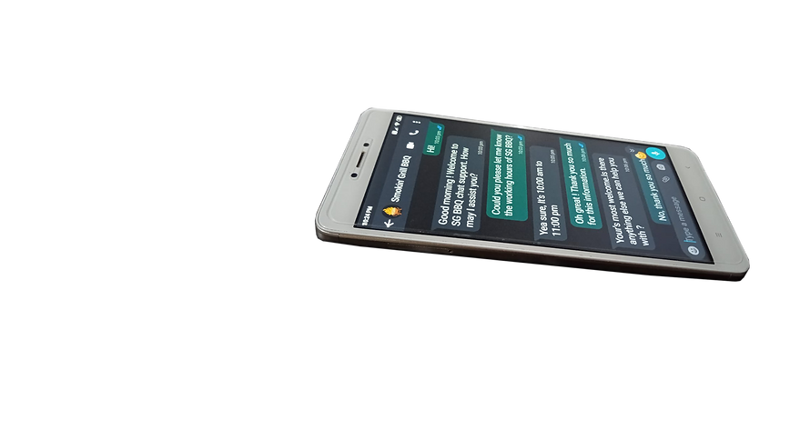
Support service


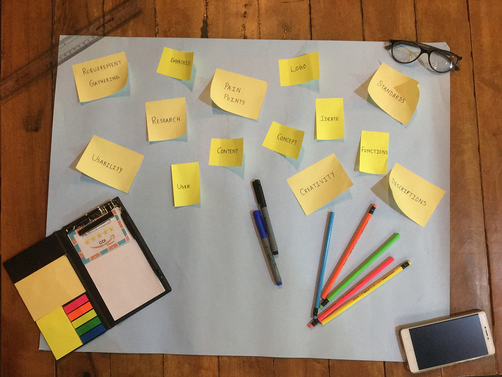
Categorizing and brainstorming interface layouts
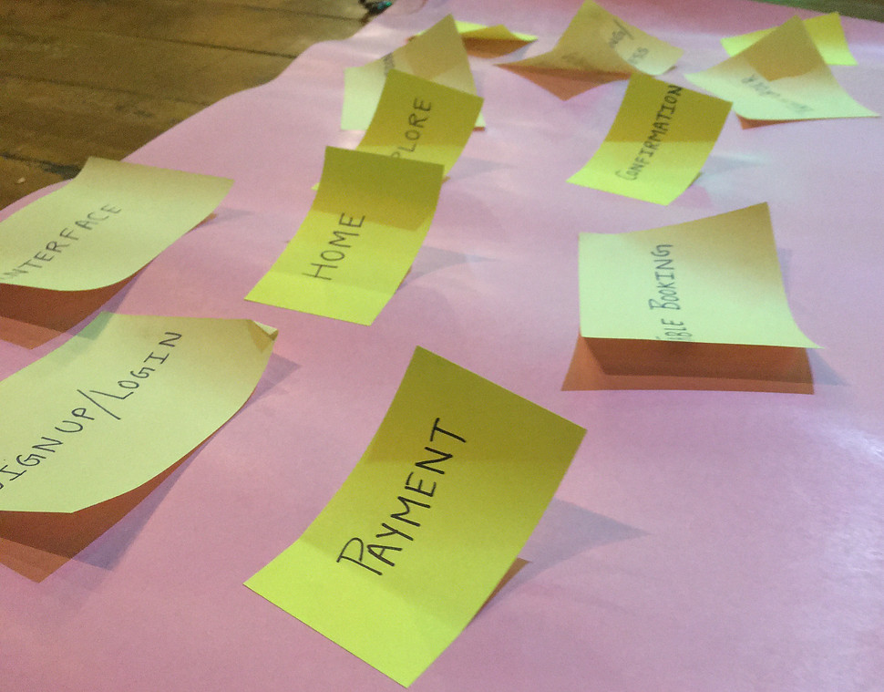
Paper Wireframes

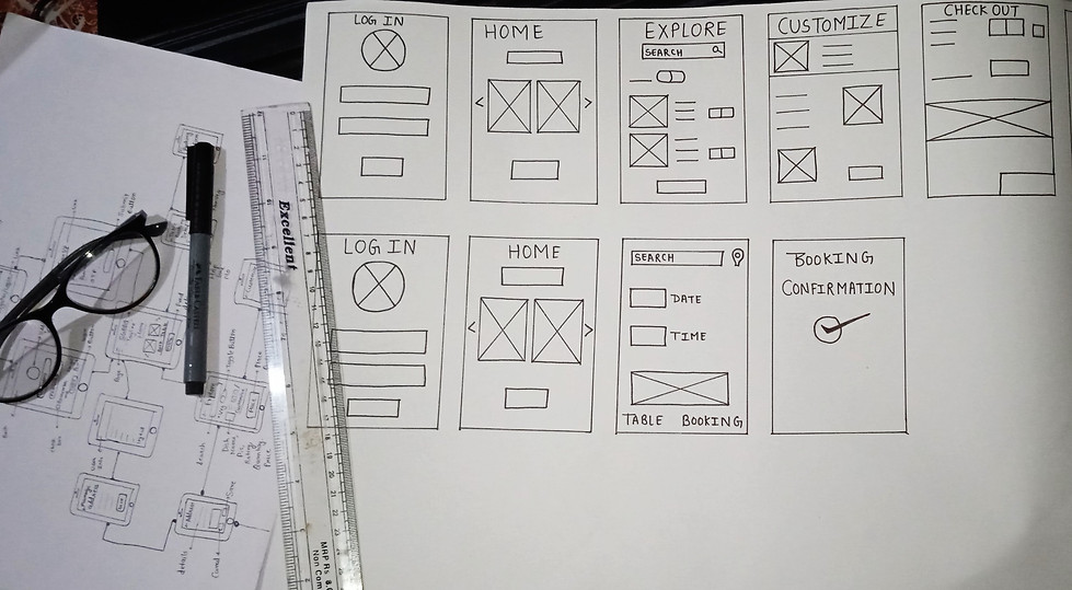

Taking the time to draft iterations of each screen of the app on paper ensured that the elements that made it to digital wireframes would be well-suited to address user pain points. As the digital arena continues to grow, online reviews are consistently important to our success. Hence the application should be user friendly so that the user can get what he/ she want. Today is a era of competitions, so consider this point and create the responsive mobile phone app. A good menu is a balancing act. Providing the adequate menu to end user along with food customizing.
Digital wireframes

This search bar at the
top of the home screen
makes it fast and easy
for users to order from
their current locations.
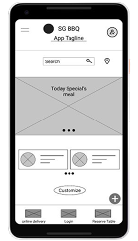
This button provides an
easy option for users to
customize their own
food.
"As the initial design phase continued, I made sure to base screen designs on feedback and findings from the user research. Users have option to customize their own food. "
Easy access to navigation
that’s screen
reader friendly.

Customers can use the dynamic checkout button to quickly buy the product they're viewing.
"Easy navigation was a key user need to address in the designs. Easy access to navigation that’s screen reader friendly. Users can use the dynamic checkout button to place the order"
Low-fidelity prototype
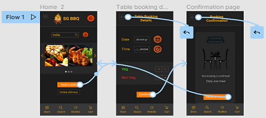
Online Table Booking
Avoid the last-minute rush and book your restaurant table online. Our Restaurant Table Booking app is quick and easy to use. So, Book a table dineout for free.
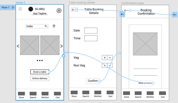
Online Order
Create a food App that allows the user completely to customize their food and quantities, also allow the user to personalize their food by tweaking the restaurant menu.
"Using the completed set of digital wireframes, I created a low-fidelity prototype. The primary user flow I connected was building and ordering food, so the prototype could be used in a usability study"
Usability study: findings
I conducted two rounds of usability studies. Findings from the first study helped guide the designs from wireframes to mockups. The second study used a high-fidelity prototype and revealed what aspects of the mockups needed refining.
Round 1 findings
Users want to order food quickly
Users want more customization options
Users want to save their previous order
Round 2 findings
The checkout process has too many unnecessary steps
Users want good navigation
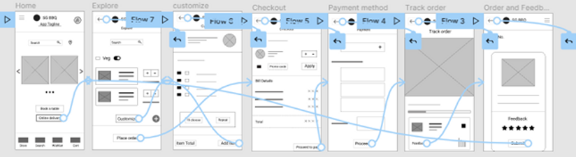
Mockups

Explore
Early designs allowed for some customization,
but after the usability studies, I added additional options. I also revised the design so users see all the customization options when they first land on the screen.
Checkout
The second usability study revealed frustration with the checkout flow. I consolidated the “Proceed to pay” and “Checkout screens” to one screen.
High-fidelity Prototype
The final high-fidelity prototype presented cleaner user flows for checkout. It also met user needs for a pickup or delivery option as well as more customization.

Accessibility considerations
Used detailed imagery for dishes and toppings to help all users for better understand the designs.
Smokin’ Grill BBQ is committed to making our website accessible for all customers. Also used icons to help make navigation easier.
We are continuously gathering feedback and improving the user experience for everyone.
Color Palette
I was glad that things were finally starting to take shape. I googled Color Palette and the first suggestion showed (https://www.canva.com/colors/color-meanings/charcoal/) which helped me choose a color palette very easily.
After playing around with the colors for a while, I came to the below conclusion Bright and subtle.

Typography...
I decided to go with an easy to understand font. Simple yet elegant. Avenir bold for Headings and Avenir light everywhere else.
Thank you for visiting !